Case study / 2023
Finnable
Addressing loan application pain points.
Team
Lead designer
UX/UI designer
Marketing, PM, and leadership
Background
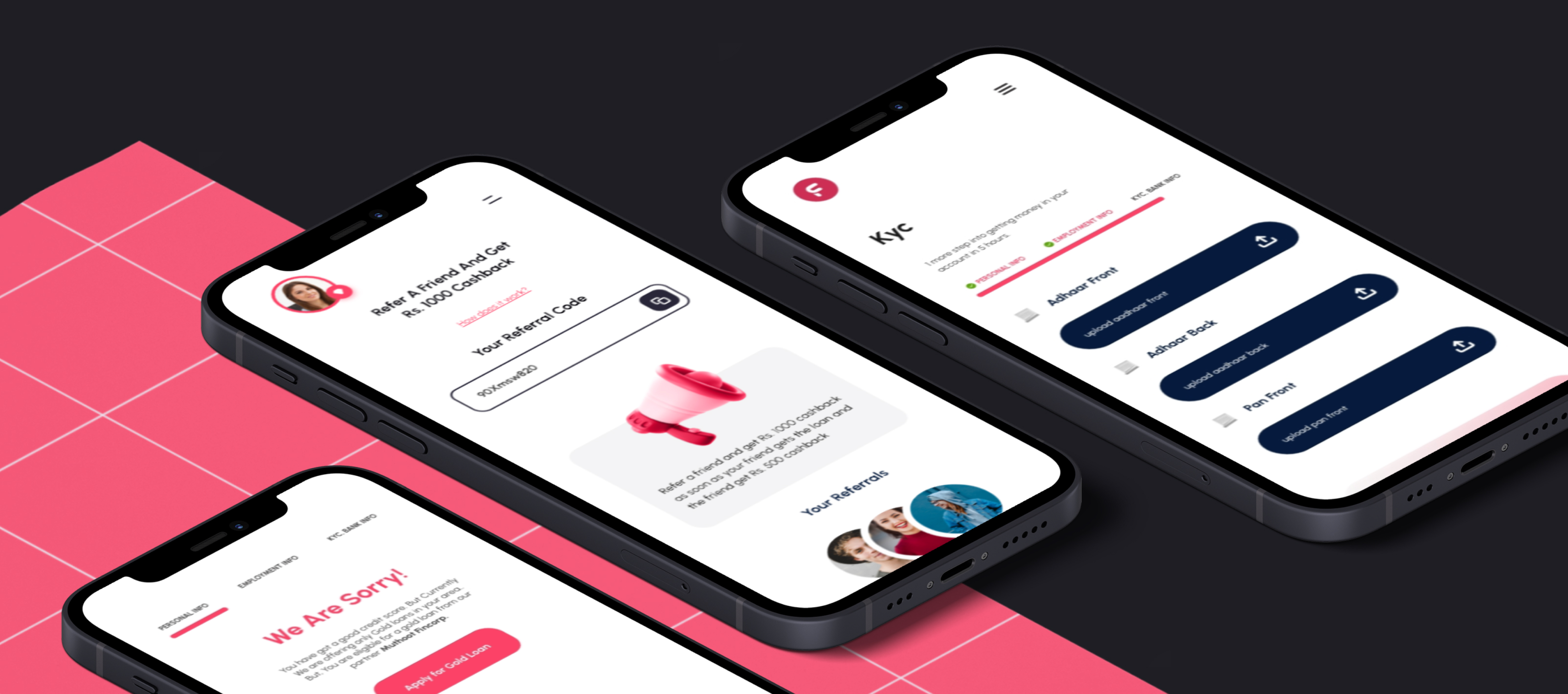
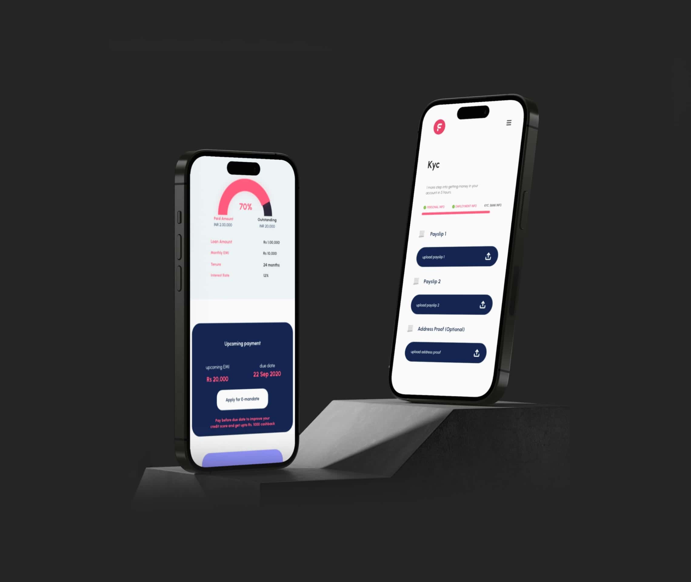
We worked with Finnable to address core issues across the app and website, streamline the loan-application process, clarify loan terms, and introduce a personalised dashboard for tracking loans and payments.
Simplify the loan-application process, enhance the user interface, and provide a clear, easy-to-use platform for managing personal finances.
01 / Journey mapping
Understanding the customer pain points.
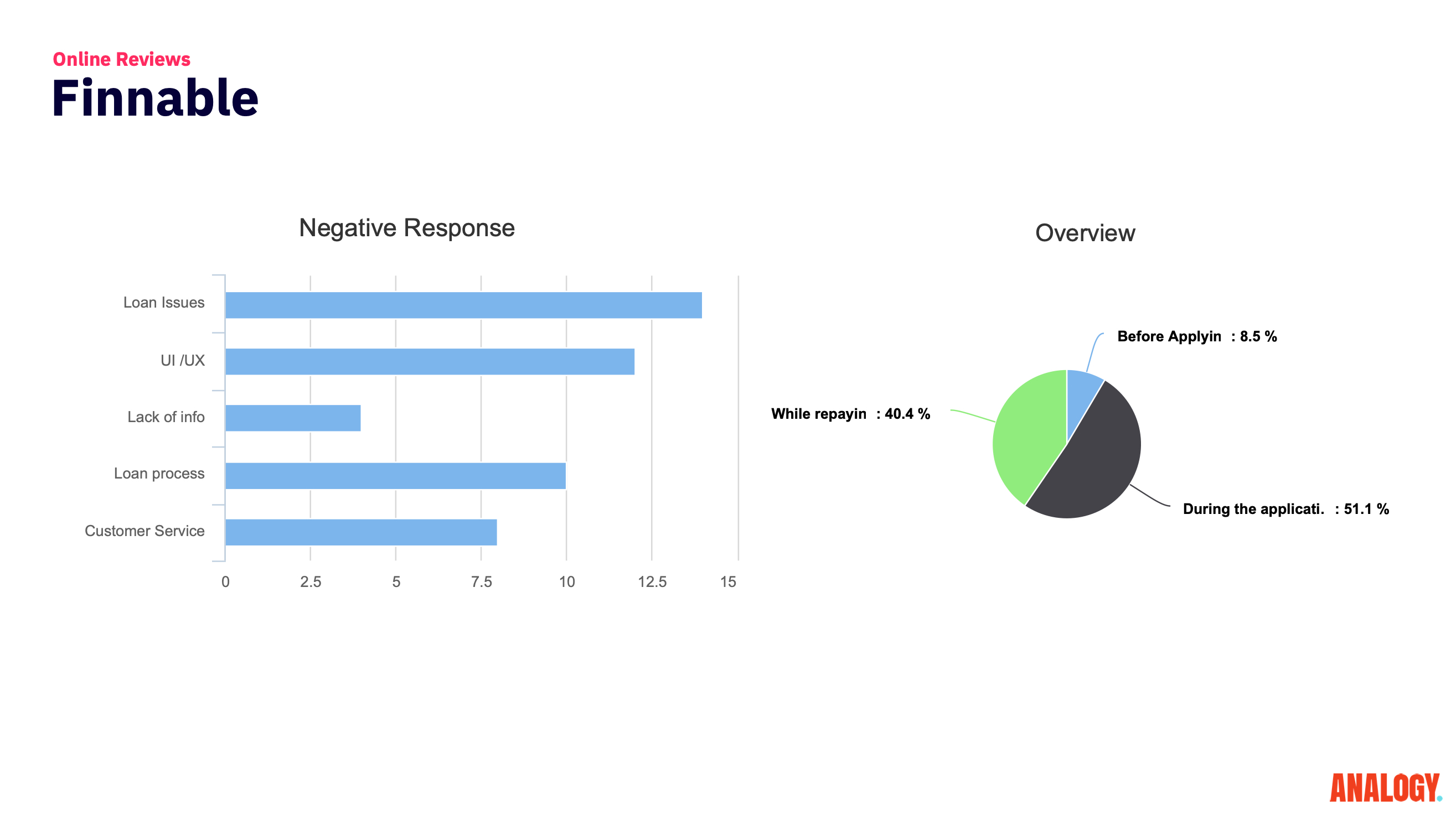
We began by examining the user journey and each stage of loan repayment to pinpoint difficulties. This deep dive focused ideation on the most critical pain points.
02 / Journey overview
UX audit.
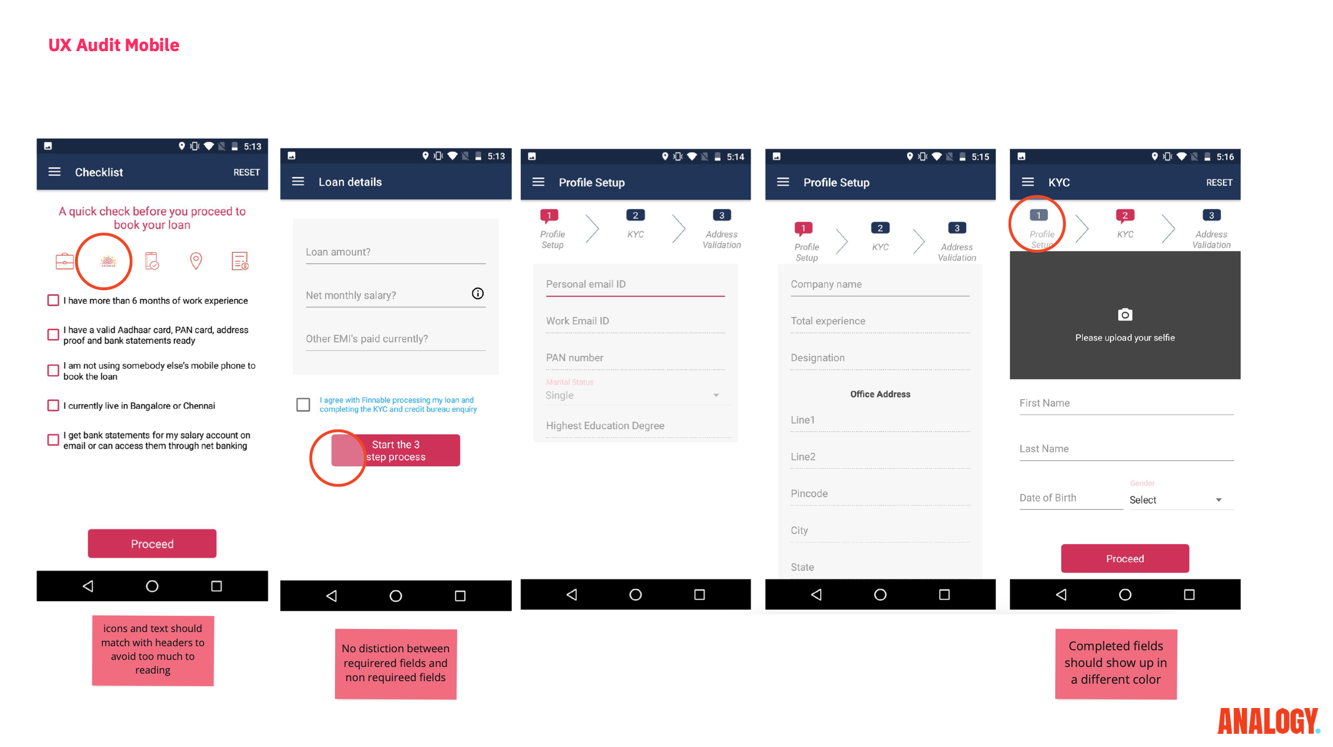
Our UX audit examined every interaction in the loan-application journey to identify flaws and friction points, uncovering areas that needed refinement to improve usability and satisfaction.
03 / Pain points
Bullseye map.
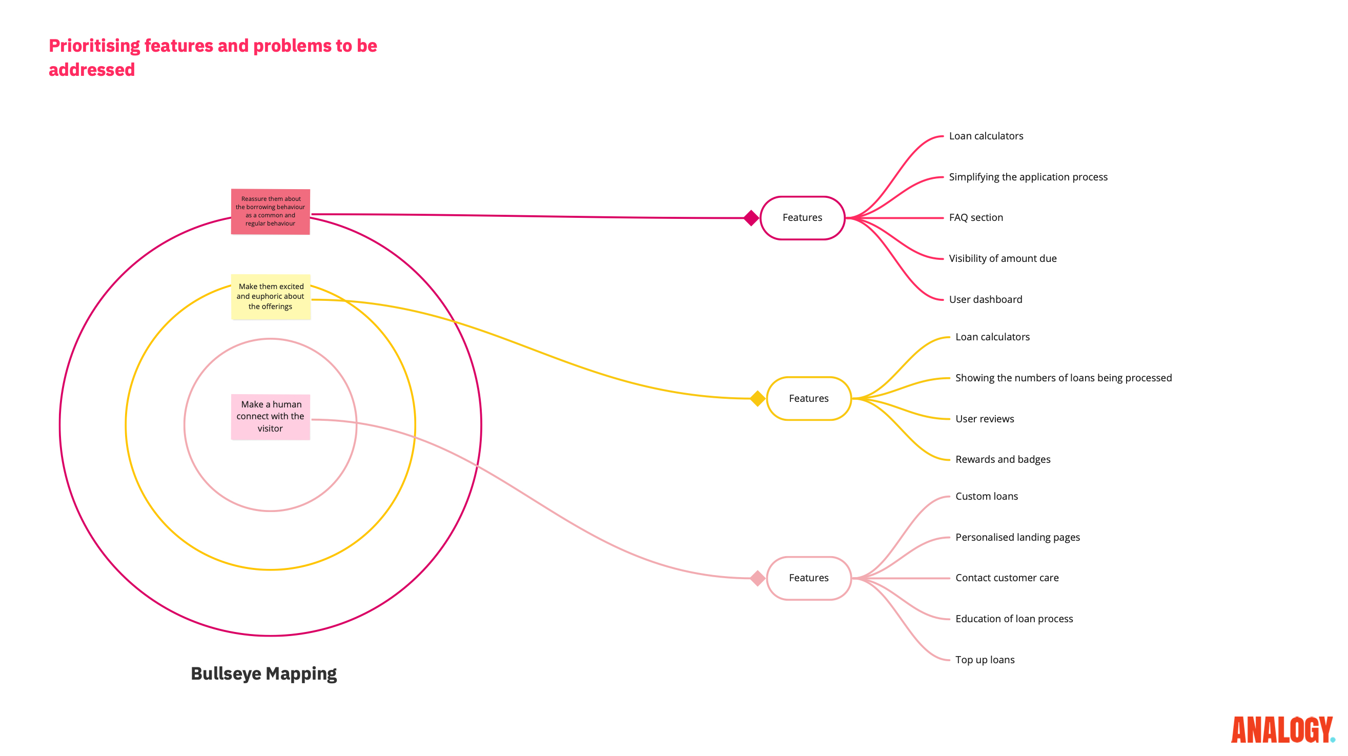
We used the bullseye framework to categorise problems and plan solutions: reinforce user reassurance, then build excitement, and finally foster a more human connection.
04 / UX audit
Information tree.
We applied an information-tree structure to organise the loan-application process, distilling complex information into an intuitive hierarchy that guided users through the core elements of the application.

05 / Prioritisation
Exploring multiple sitemaps.
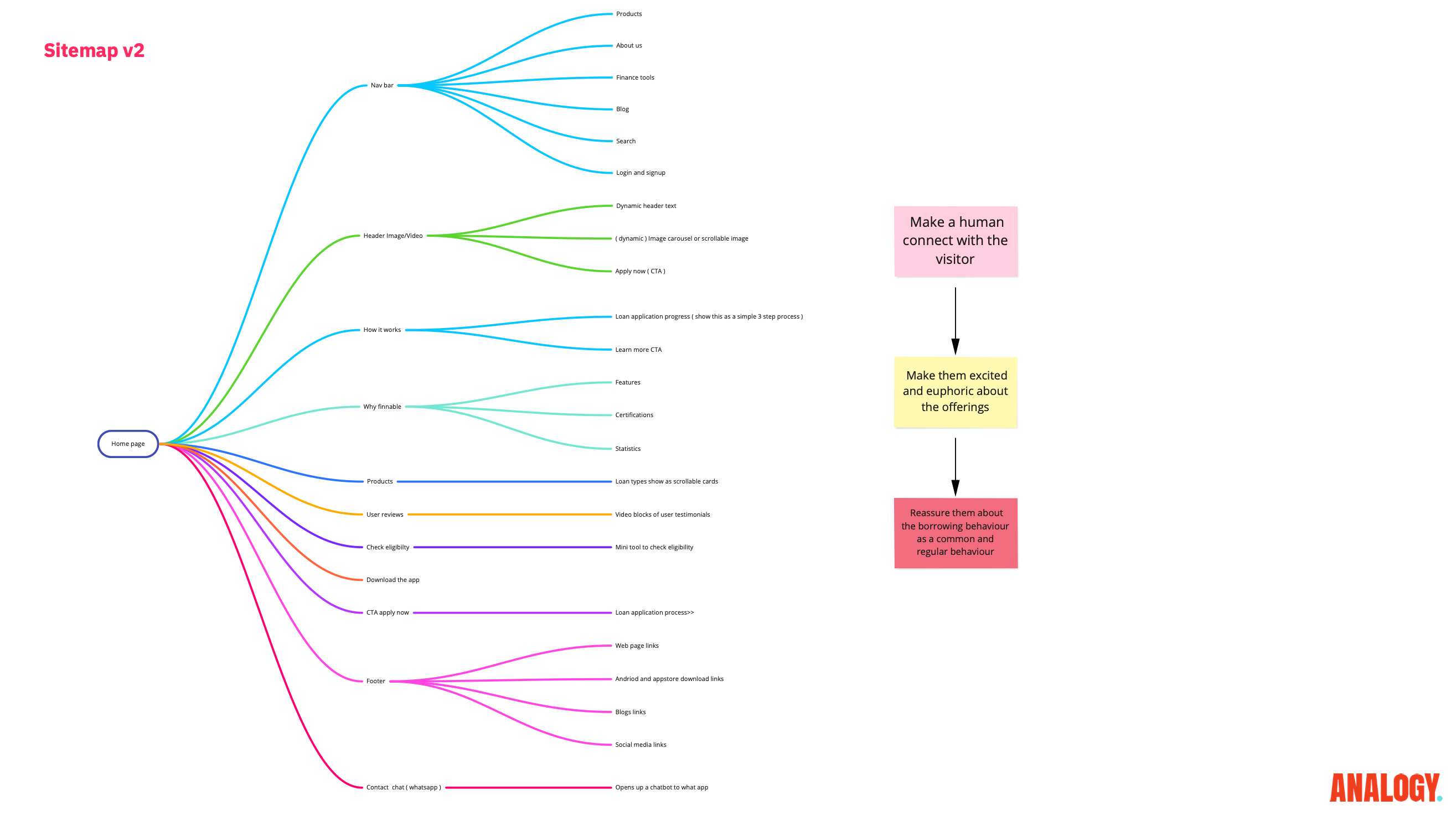
We explored different sitemap configurations to optimise landing-page journeys, testing which structures provided the most clarity and encouraged progression.
06 / Information architecture
Problem-based wireframing.
Each wireframe was built as a hypothesis against user needs and expectations, then referenced against feedback to validate assumptions and ensure relevance.
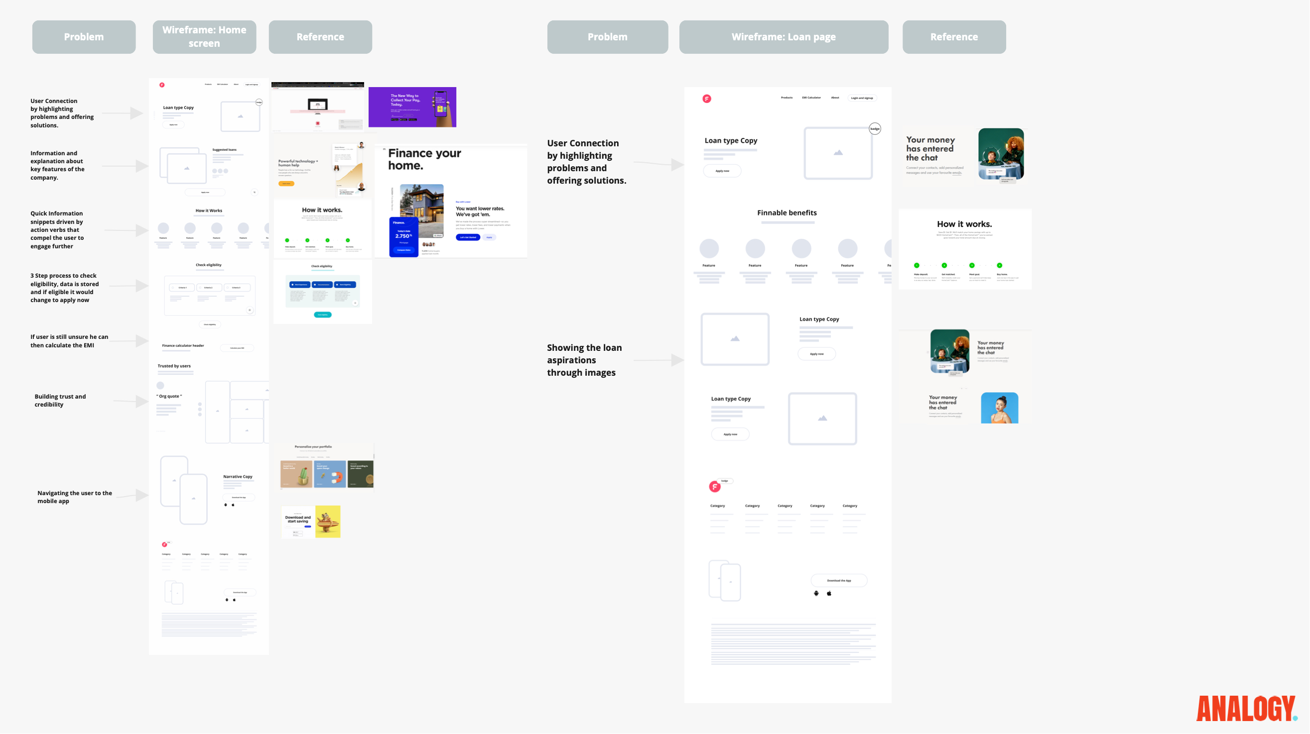
07 / Sitemaps
Problem-based wireframing.
Early design directions were continually tested against user needs and feedback so the wireframes remained purposeful and relevant.
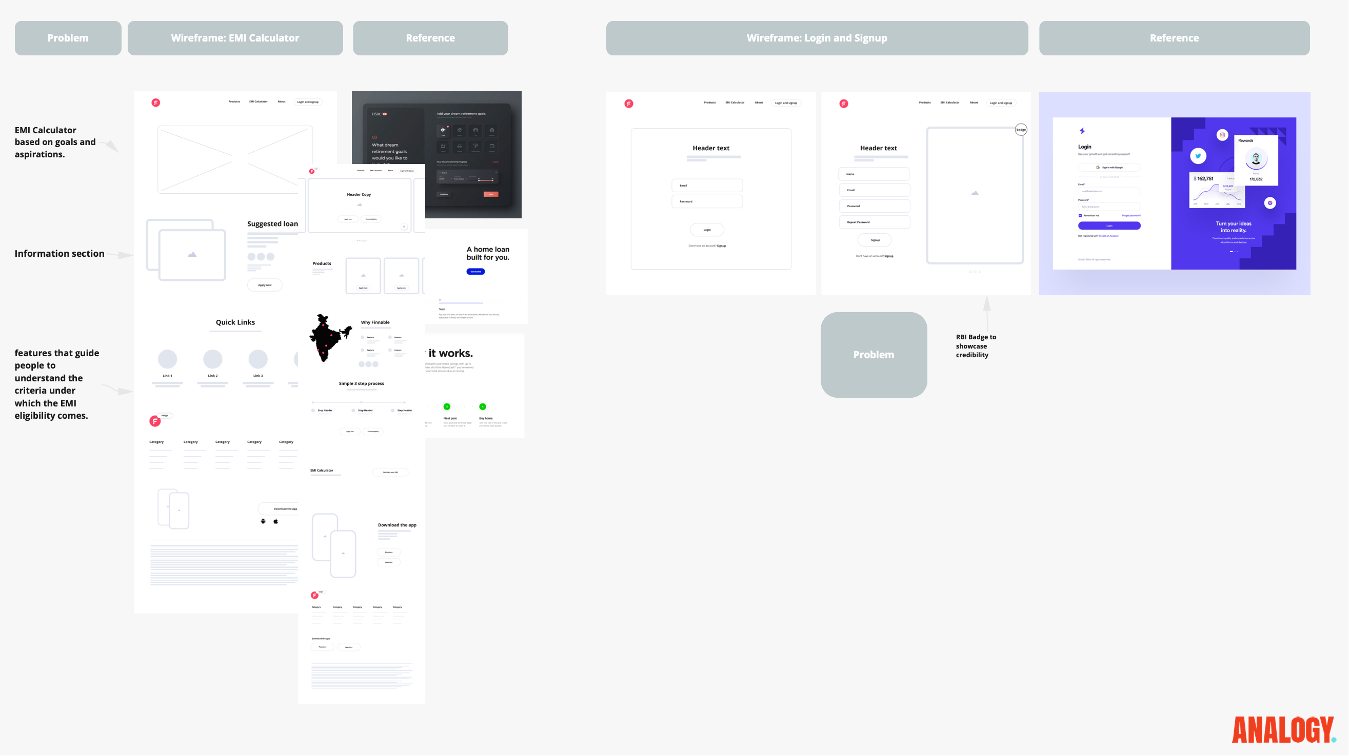
08 / Wireframes
Eligibility calculator.
The eligibility calculator helped users determine their loan qualification quickly, streamlining the journey and supporting better-quality conversions.
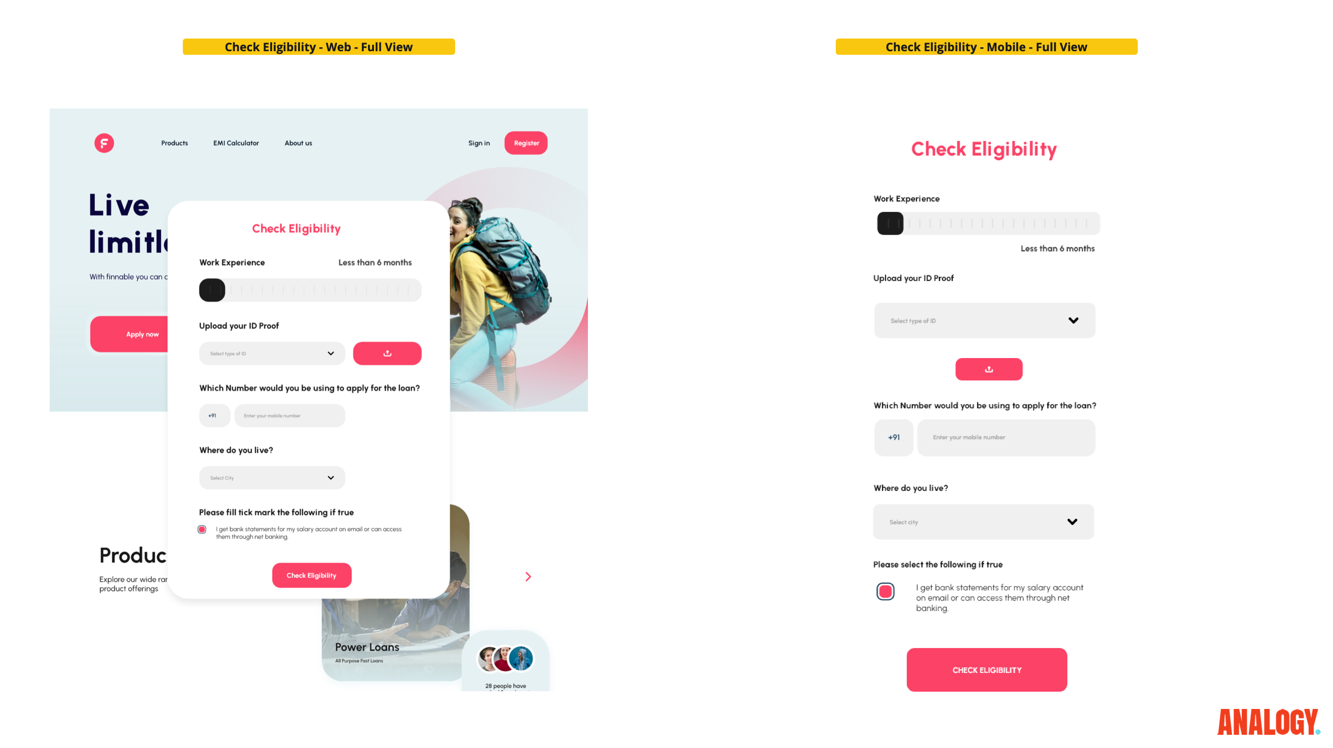
09 / Eligibility
Shortening the process.
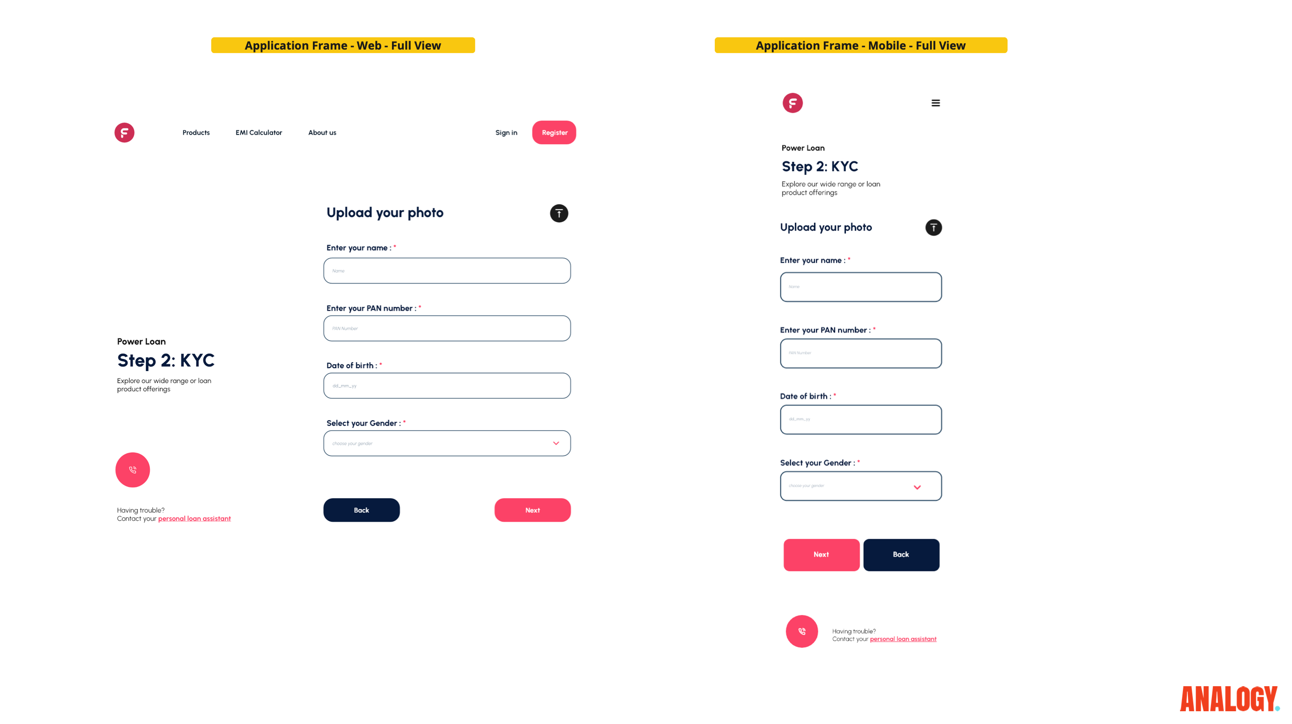
We used eligibility data and existing-user information to abbreviate the loan application while maintaining a personalised and efficient experience.
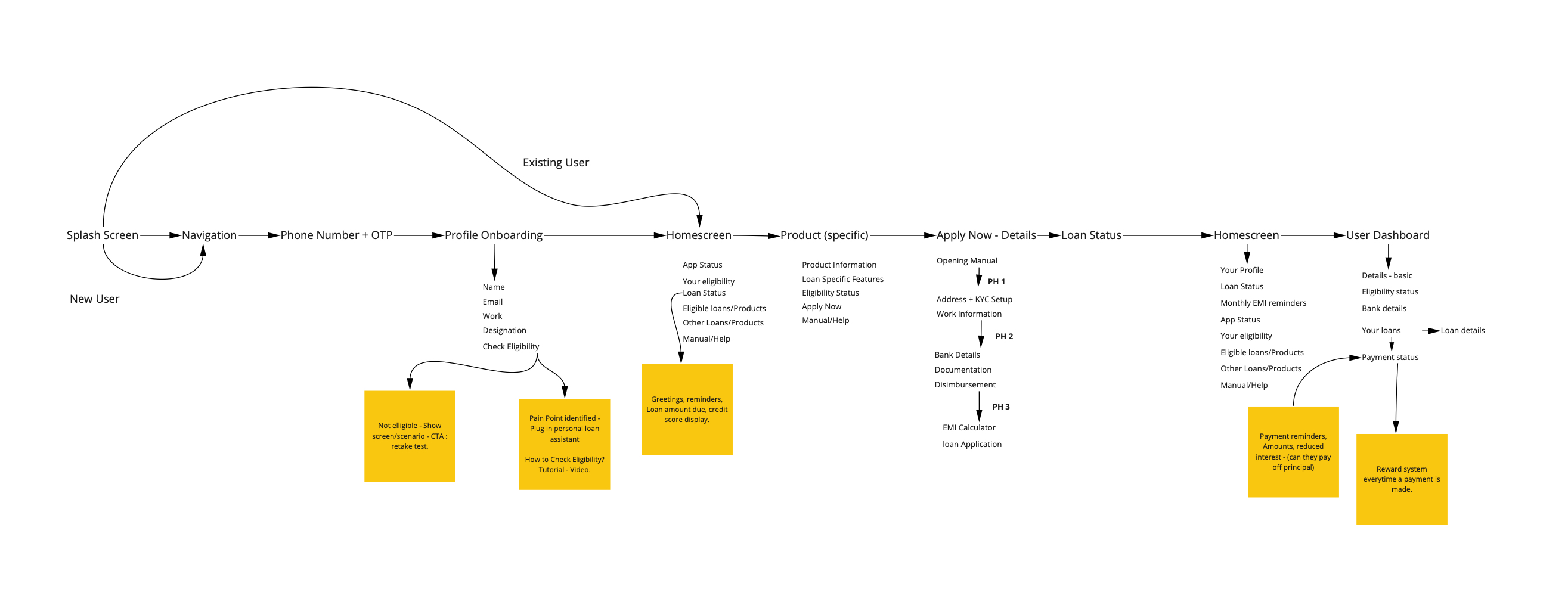
10 / Shortening the process
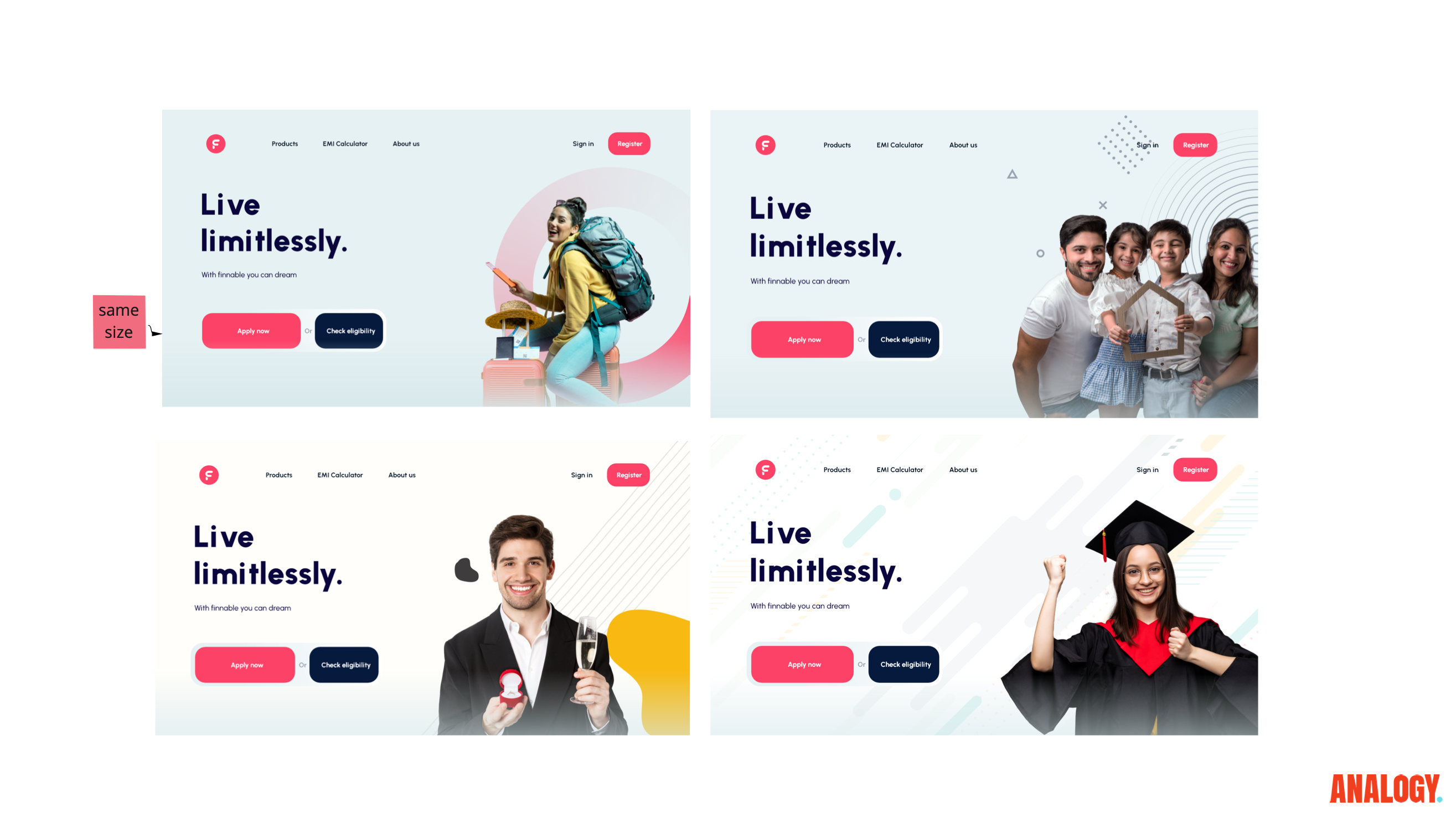
Custom imagery.
Tailored visuals were designed to connect with key demographic segments and their motivations, creating a more relatable and engaging narrative throughout the platform.
11 / Custom imagery
Make finance approachable, not vague.
Tailored imagery supported a more human financial tone while keeping terms, eligibility, and repayments central. It gave the journey warmth without competing with the information people came to understand.
12 / Product direction
A clearer loan experience to execute.
The final direction brought audit findings, information architecture, eligibility, and a shorter process into one product story: clearer trust moments and a more actionable path for the Finnable team to build.