Case study / 2023
Insane AI
Rethinking fitness, systems for engagement.
Team
Design lead & project manager
Brand designer
UX researcher
Background
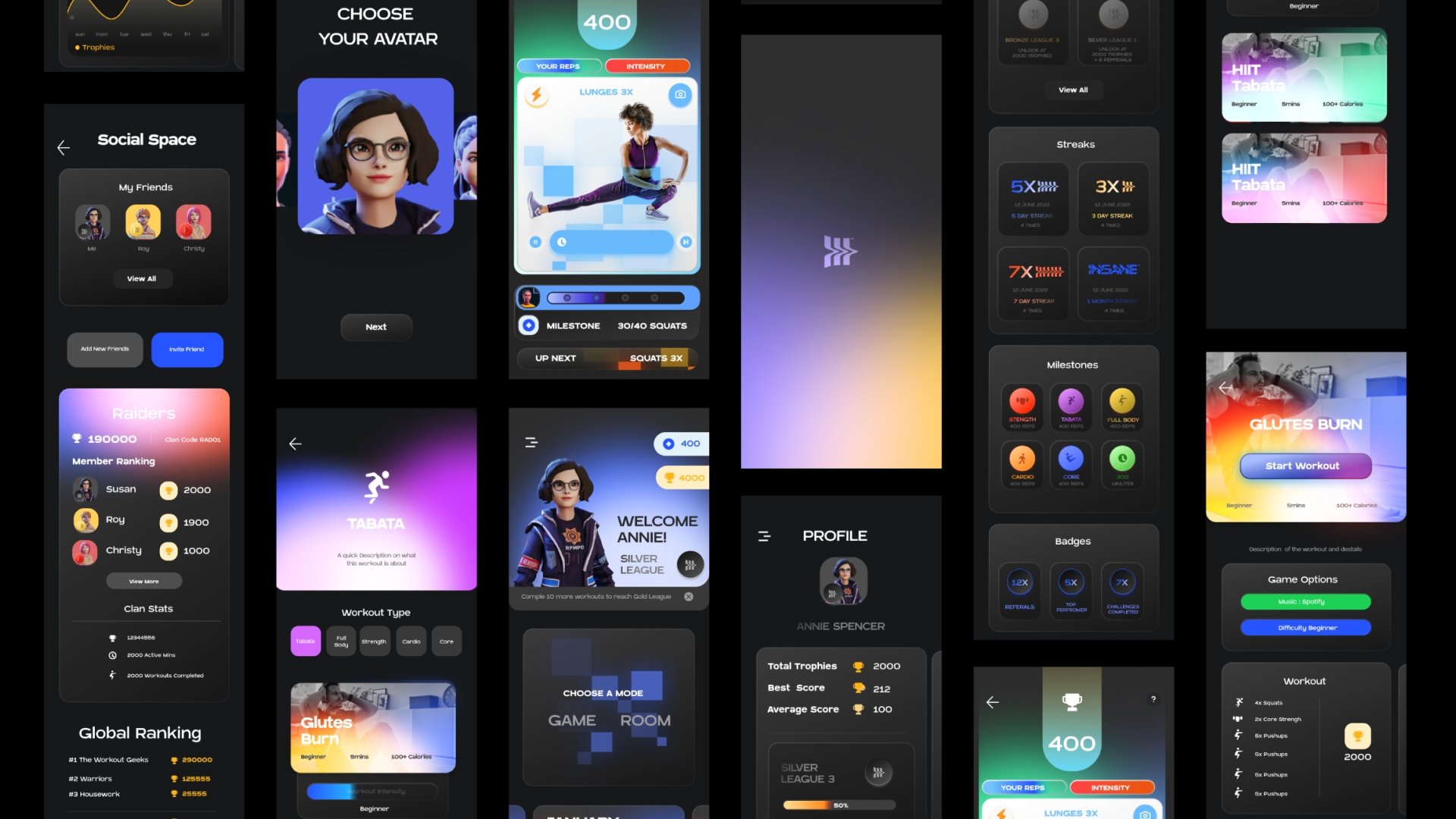
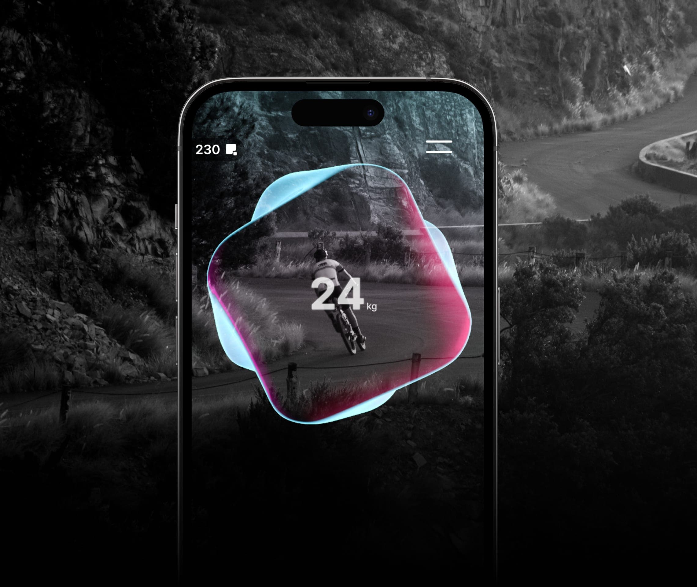
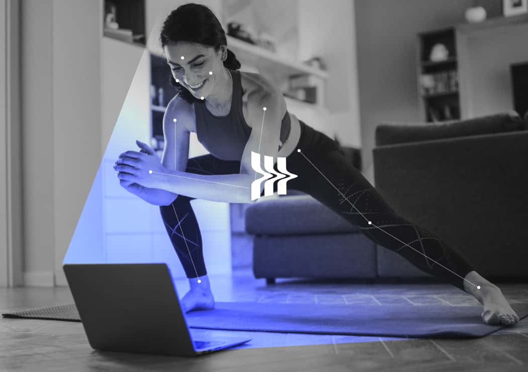
Insane AI combines social fitness with a gamified AR experience. AI-powered motion tracking uses the front camera to track movement, measure performance, and provide real-time feedback for an immersive workout.
We partnered with Insane AI to create a user-friendly app that blends known elements to ease adoption while building a scalable, consistent fitness product.
01 / Brand in UX
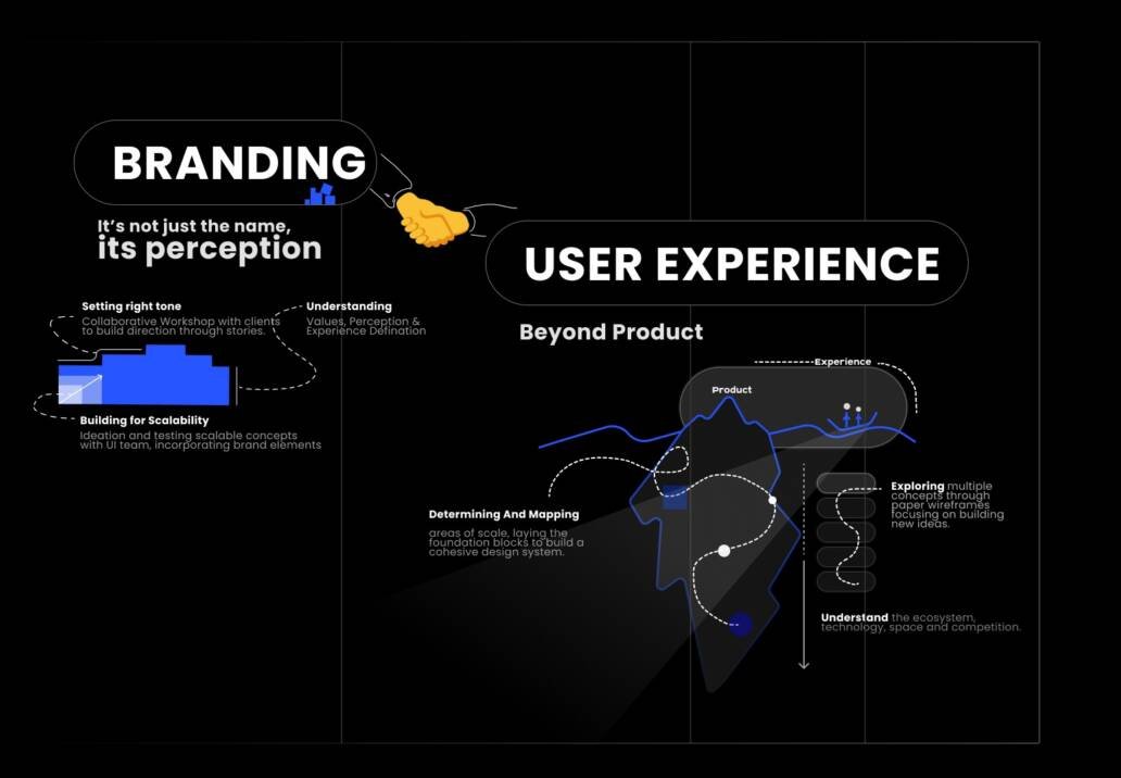
How does brand play a role in UX?
We developed a brand-centric approach, translating brand values into design elements. Attention to visual detail built recognition through scalable UI elements that resonated with the target audience.
02 / Feature groups
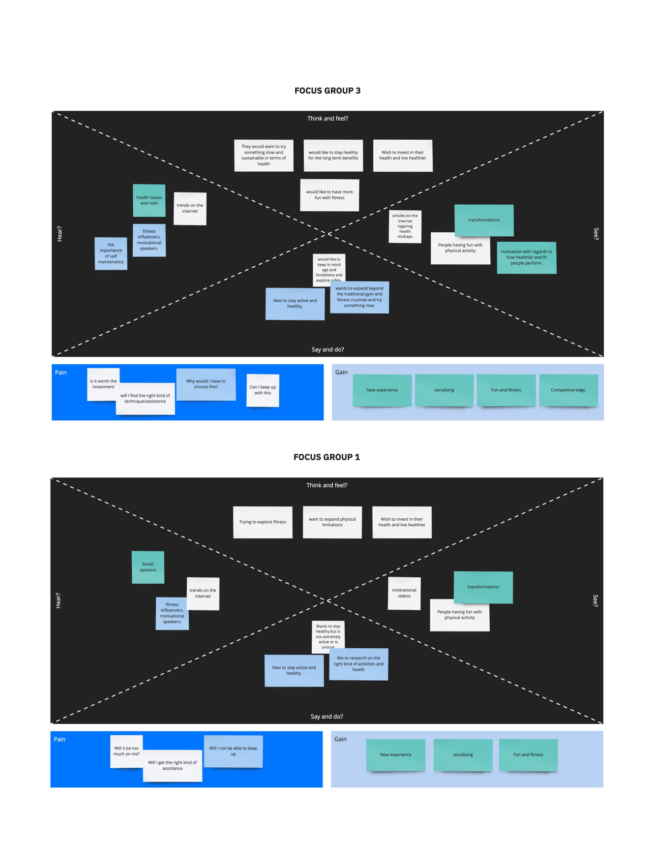
Feature groups based on insights.
We balanced business and user goals throughout the product-development process, focusing on an engaging fitness experience that supported market success and customers aligned with the brand’s values.
03 / Style scapes
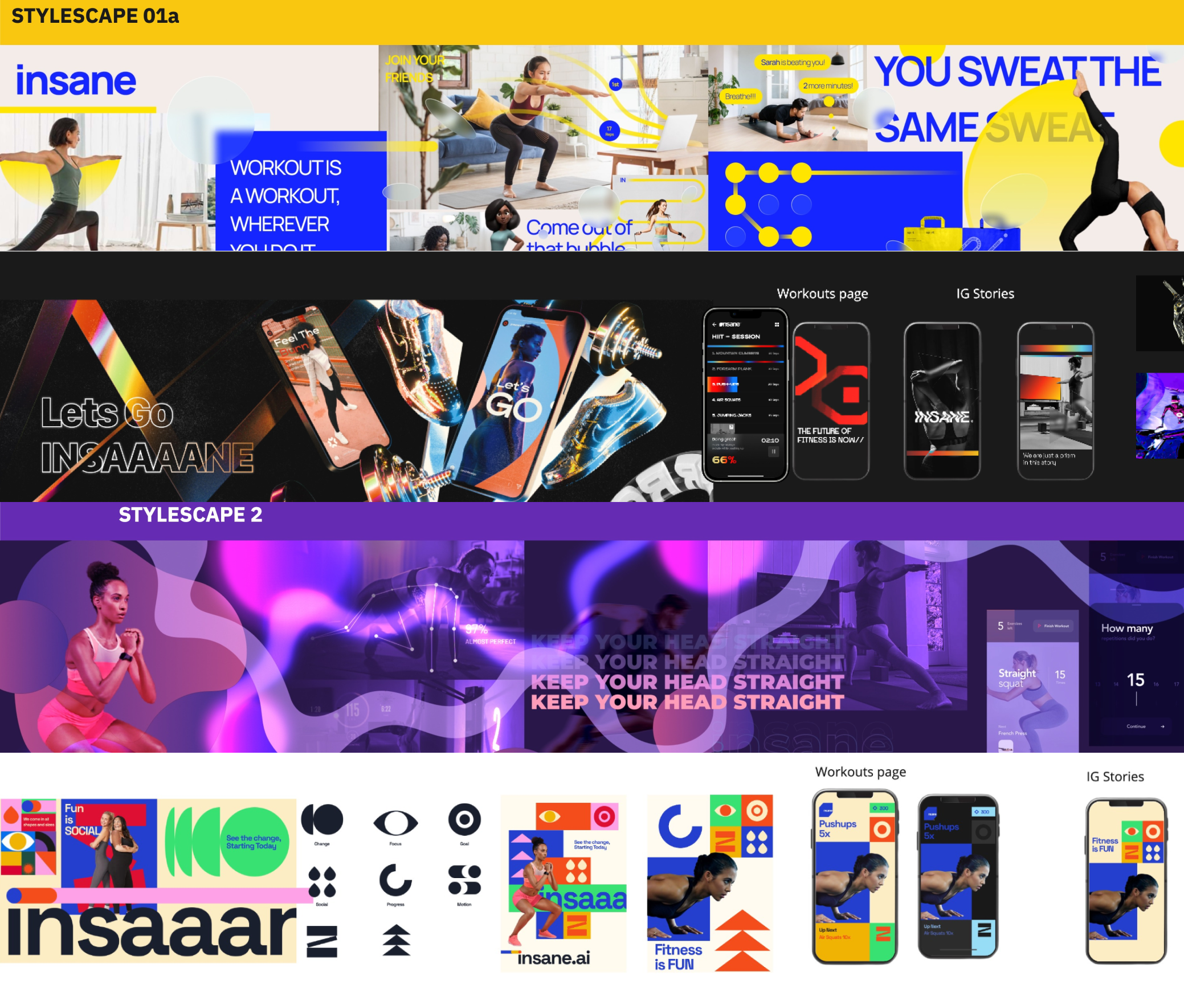
Distinct style scapes that evoke emotion.
Style scapes gave an end view of the product direction while evoking emotional responses and providing a foundation for the design system.
04 / Stakeholder sessions
In-depth sessions with leadership and key stakeholders.
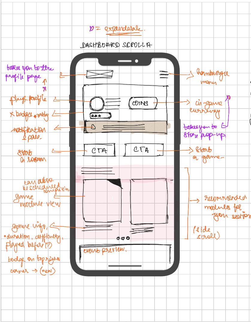
We addressed usability issues by translating functions into user flows, developing wireframes, and facilitating workshops with leadership and key stakeholders.
05 / Prototype loop
Experiment. Prototype. Test. Record. Implement.
Because many features were complex and new, we did not rely solely on benchmarks and best practice. We tested ideas, converted them into wireframes, and recorded stakeholder feedback throughout the process.
06 / Guidelines
Systems and guidelines.
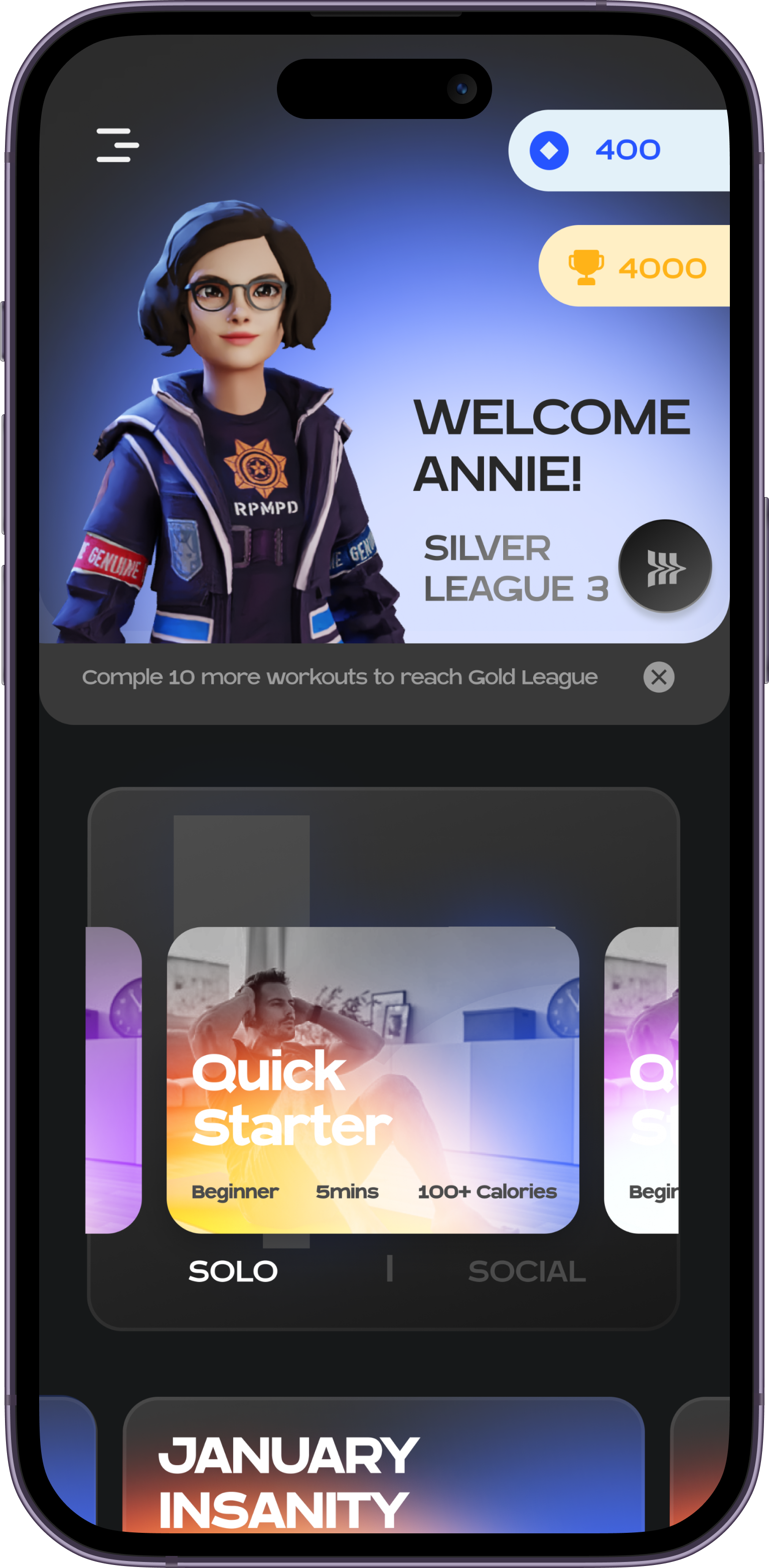
Before moving into visual design, we created a system designed for scale and intuitiveness. It evoked the brand’s emotion while providing building blocks for product assets and features.
07 / System in motion
Incorporating scalable systems.
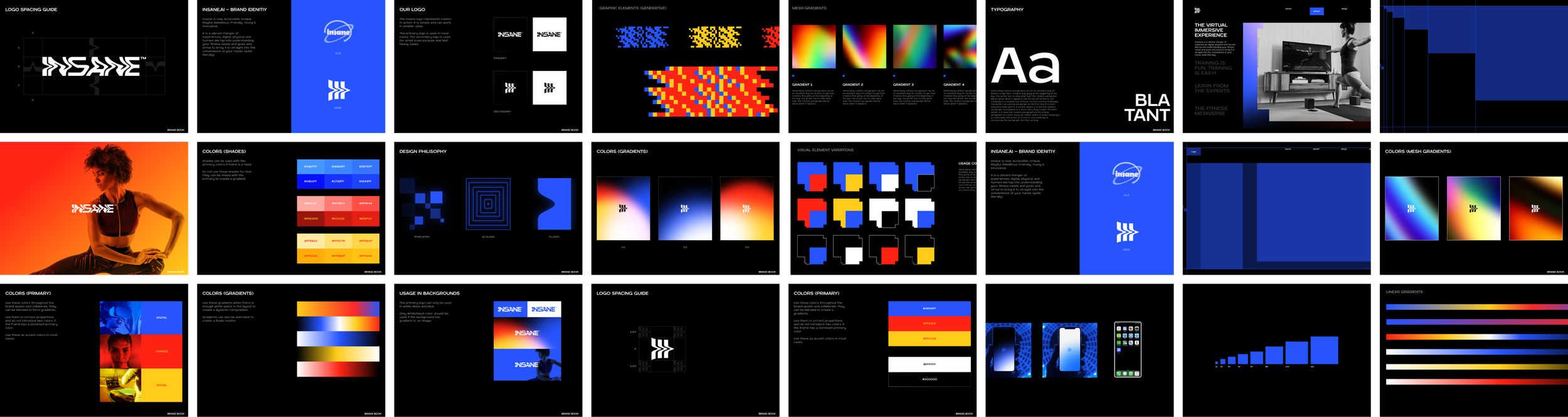
We created a scalable design system using logos and relatable terms to denote user progress, align with brand values, and guide users towards their goals as the product expands.

08 / Interaction framework
Interaction design framework.
Interaction-design principles formed the foundation of the user-friendly UI, guiding an intuitive and visually appealing product that met user needs and client objectives.
09 / Progression
Combining the game world and social space.
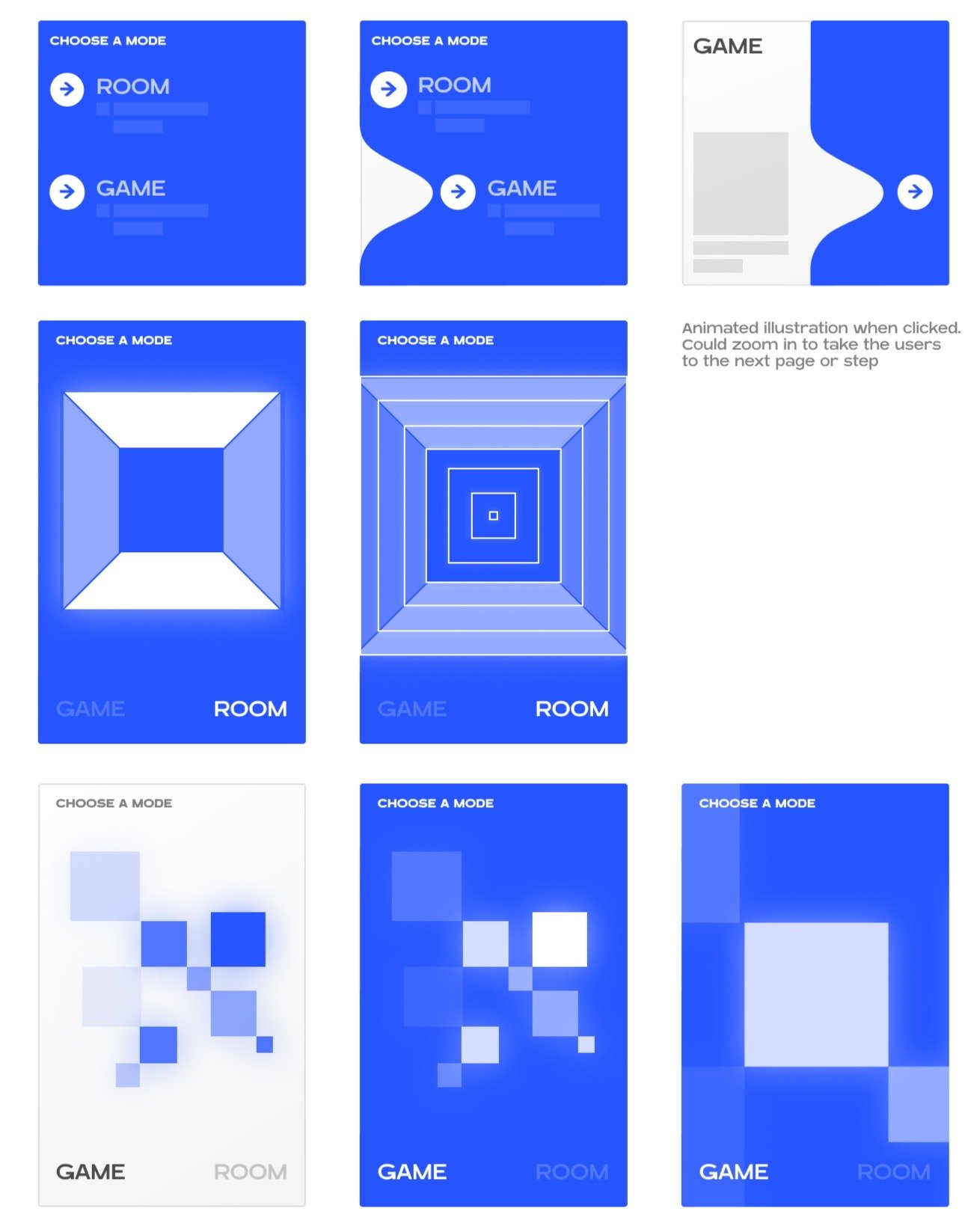
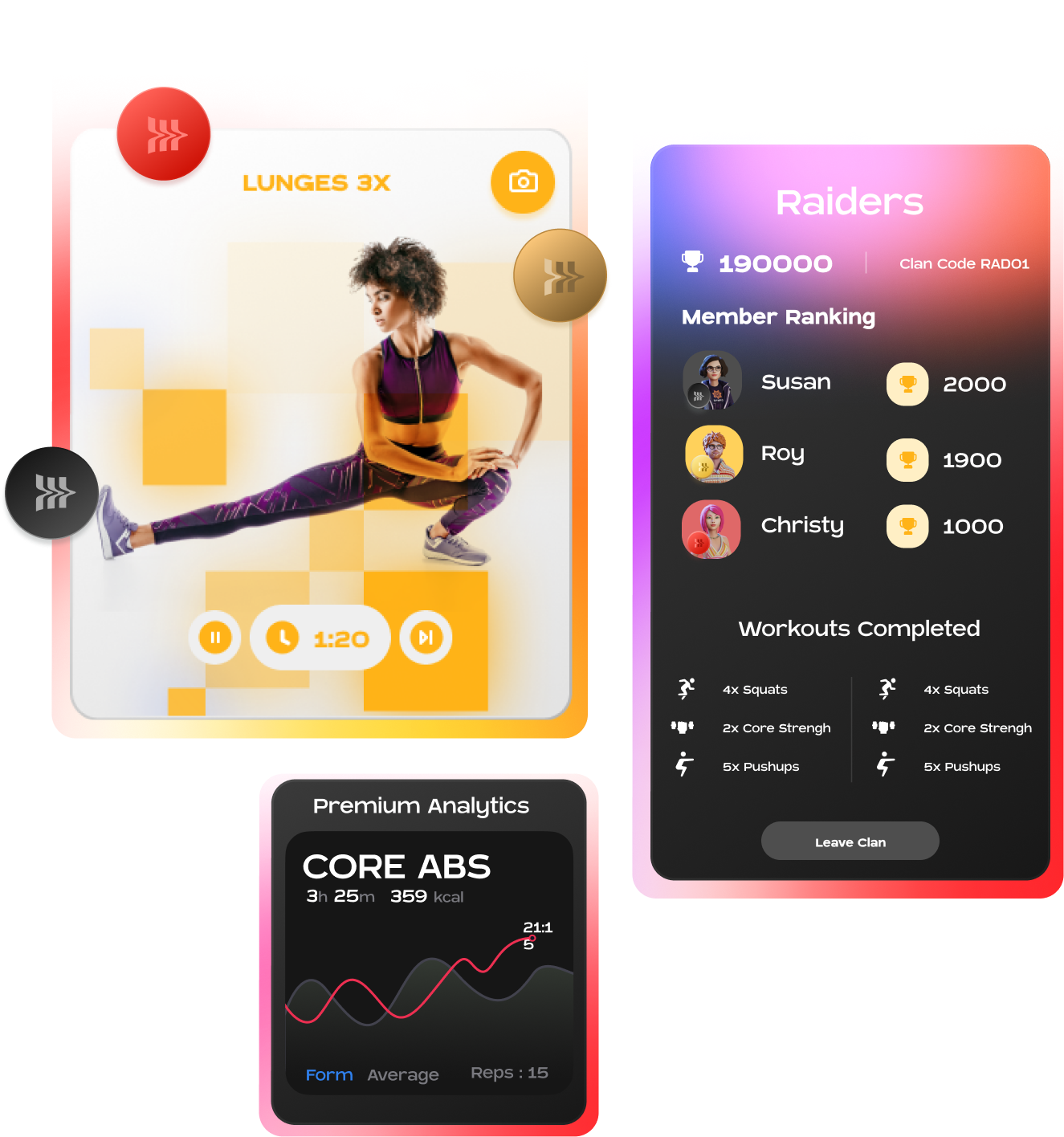
We created an engaging fitness platform with workout guidance and progress analytics, while incorporating social spaces for interaction and competition to enhance the community feel of the app.
10 / Social space
Developing challenges and routines based on real-world scenarios.
Creating a scheduling system for social teams and individuals required a compact design with clear instructions. We analysed real-world gym routines and simplified them into day-by-day navigation.
11 / Routine levels
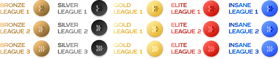
Scalable progression system to incorporate brand elements.
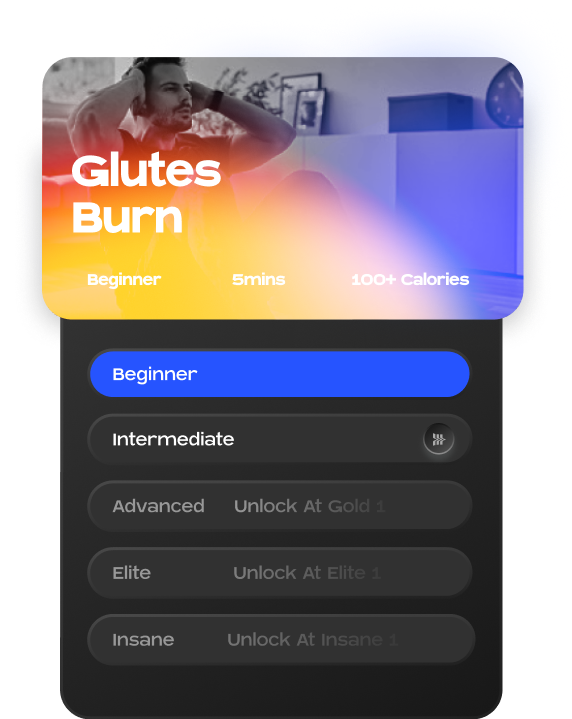
The progression system uses brand elements and relatable terms to guide users towards their fitness goals as routines and challenges expand.
12 / Product direction
Impact and reach.
We created a system designed for scale and intuitiveness that felt natural to users, receiving an overwhelmingly positive response.