Panasonic IIC, Tata Elxsi, and an external research agency
Background
Miraie needed to make connected-home control feel useful on day one for Indian households, while still creating space for automation, analytics, and appliance intelligence over time.
A user-friendly digital experience that blends familiar physical cues with a gradual path into new technology.
01 / Process
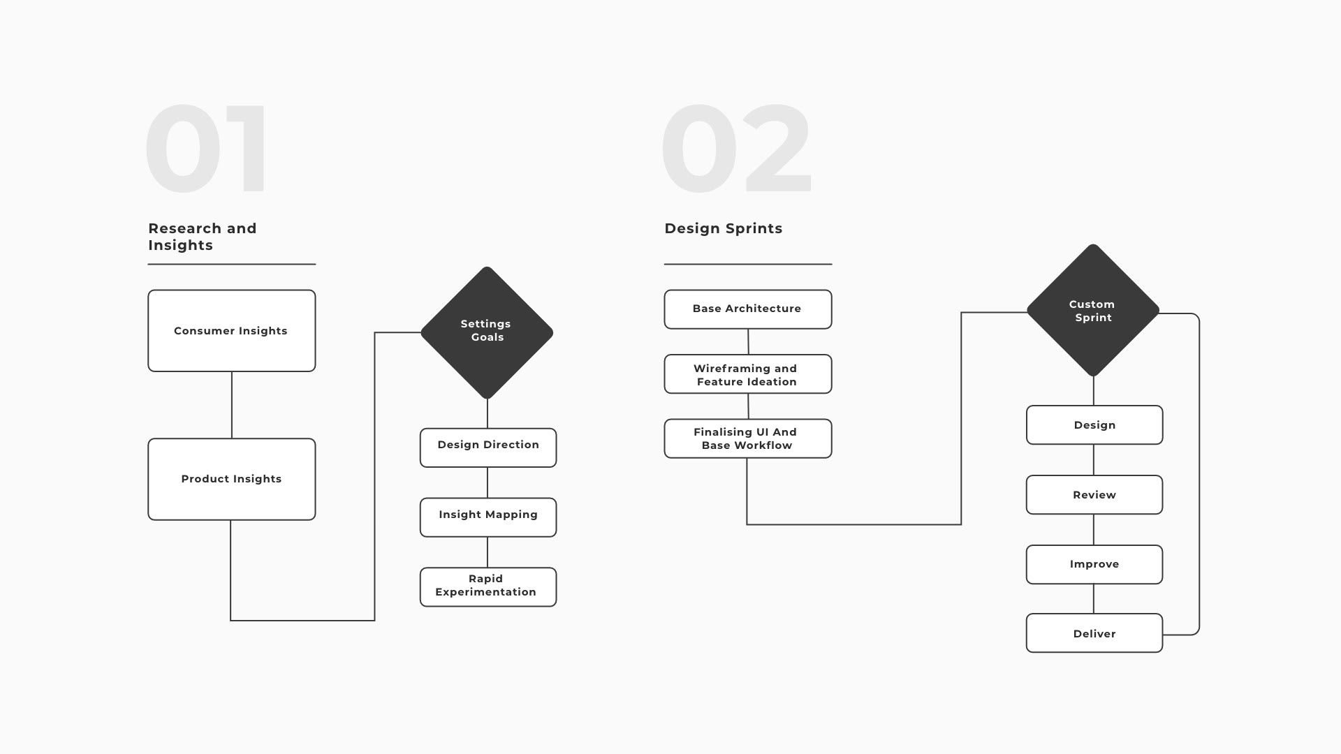
Customising the design process to achieve success.
We tailored the design plan to Panasonic’s way of working, combining a structured research approach with a flexible process to create a smart-home design that is easy to use, engaging, and able to grow.
02 / Research
Understanding consumer device usage and behaviour.
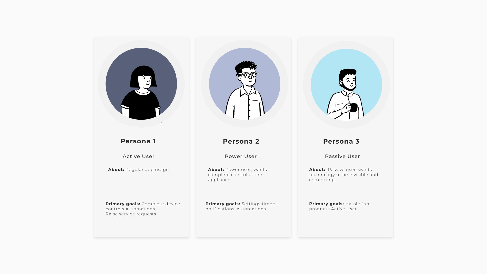
Through interviews and home visits, we categorised users as active, passive, and power users. Basic functions supported the first two groups, while advanced features catered to power users across Indian households and devices.
03 / Interaction model
Interaction building blocks.
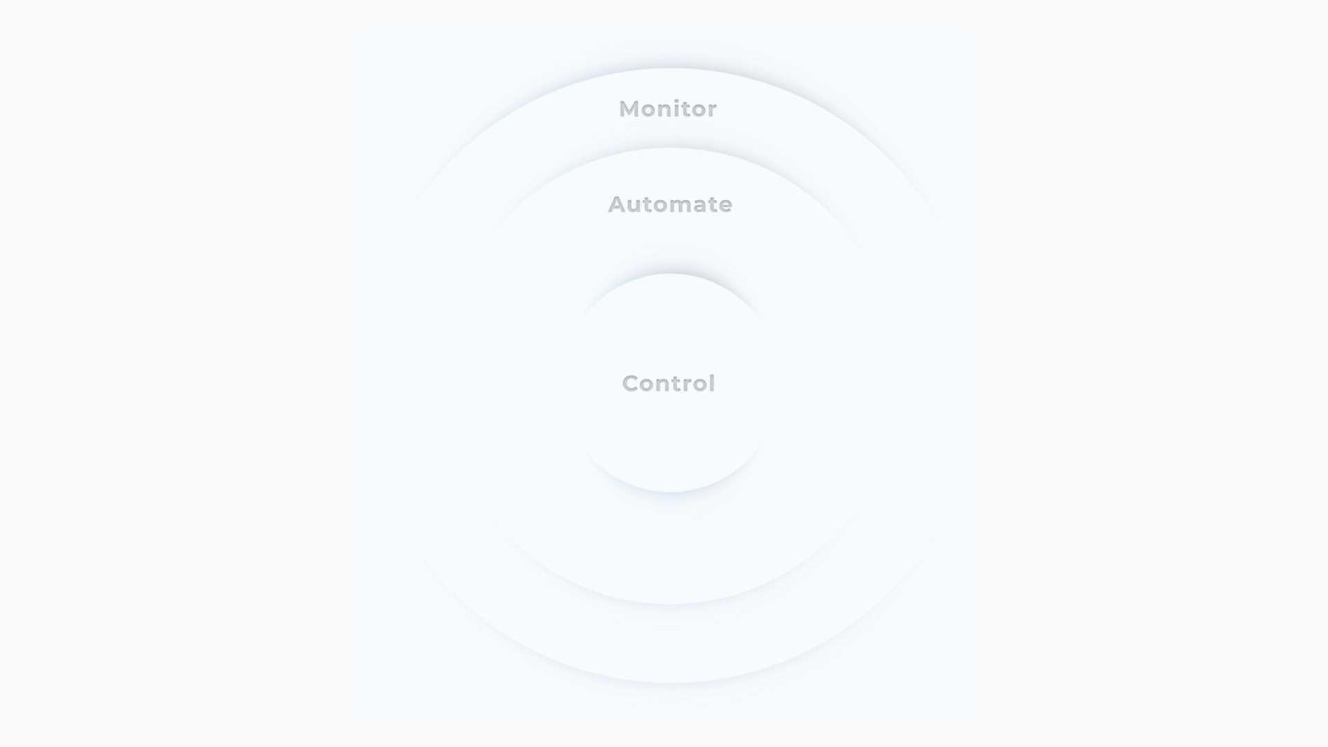
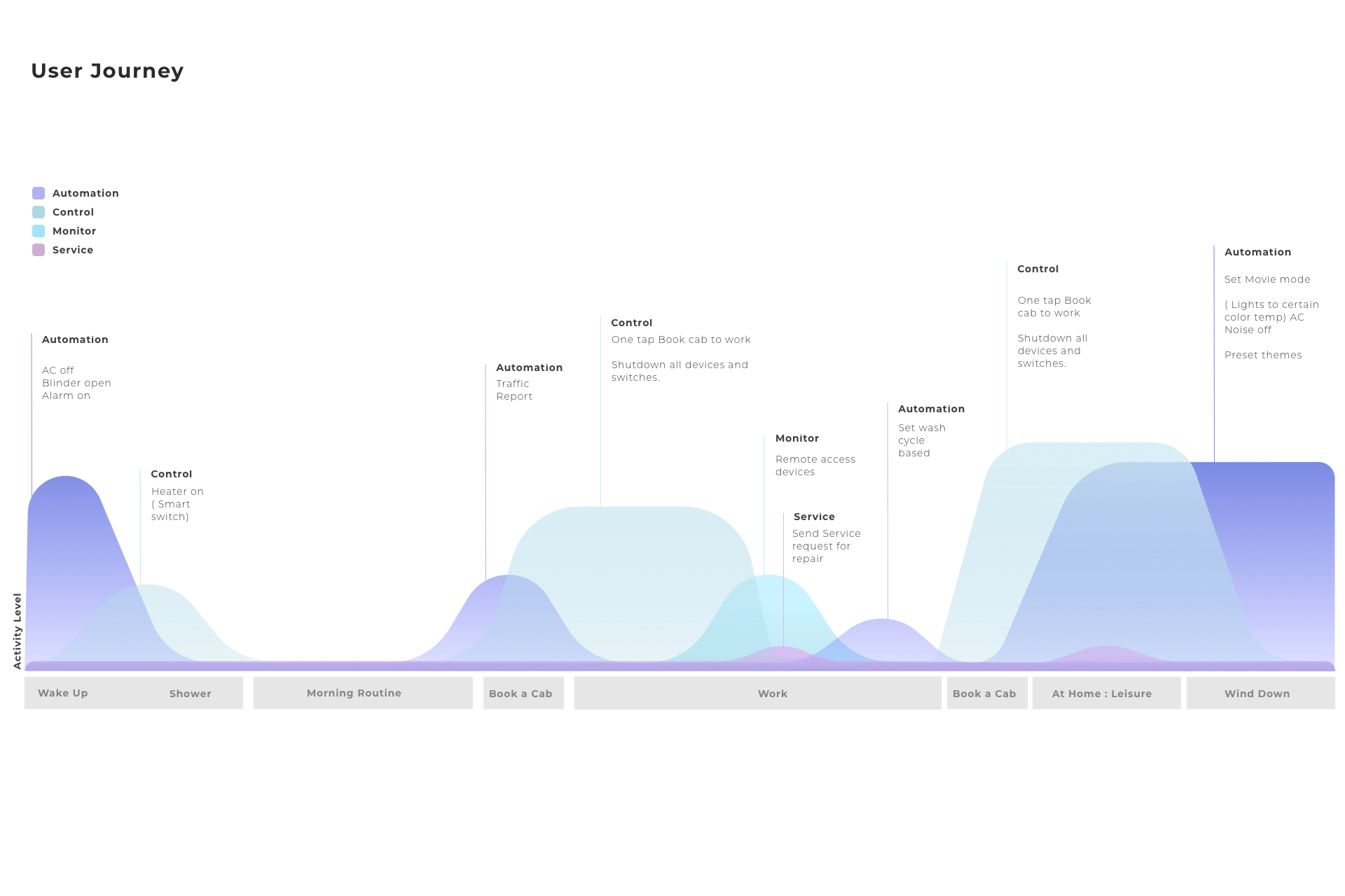
We looked more deeply at user journeys, levels of application use, and levels of control, stacking them into a platform that considered a full day of smart-home activity.
04 / Journey
A smart home is used across a day, not in one session.
Mapping daily moments revealed when the interface should stay quiet, show status, or invite a person into a richer routine. It shifted the experience from a list of appliance features into a system that followed real household behaviour.
05 / Alignment
Make usability visible before it becomes expensive to change.
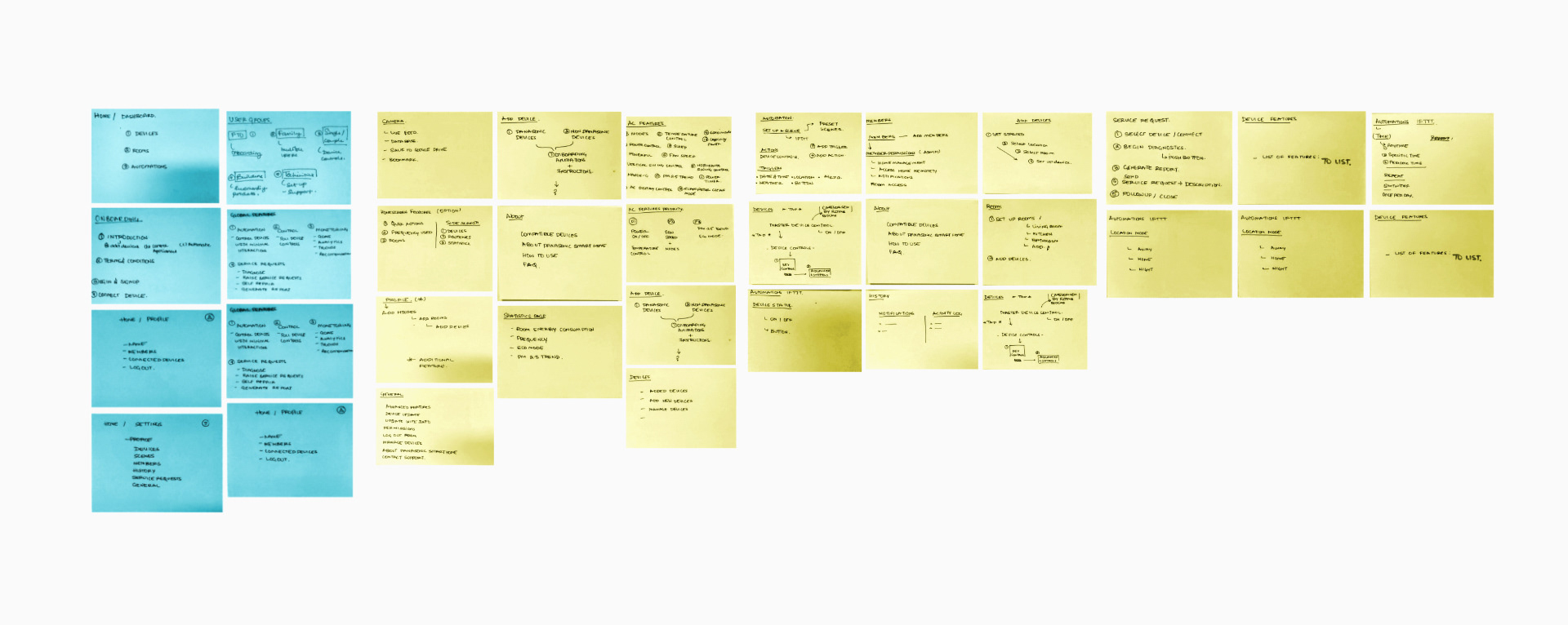
Leadership sessions turned appliance functions into flows, wireframes, and workshop artefacts. Device capability, marketing goals, research findings, and interface delivery could then converge around one clear product story.
06 / Adoption
Market data to base interactions.
We worked closely with the marketing team to understand how they wanted to develop the overall application experience.
07 / Field research
Field research.
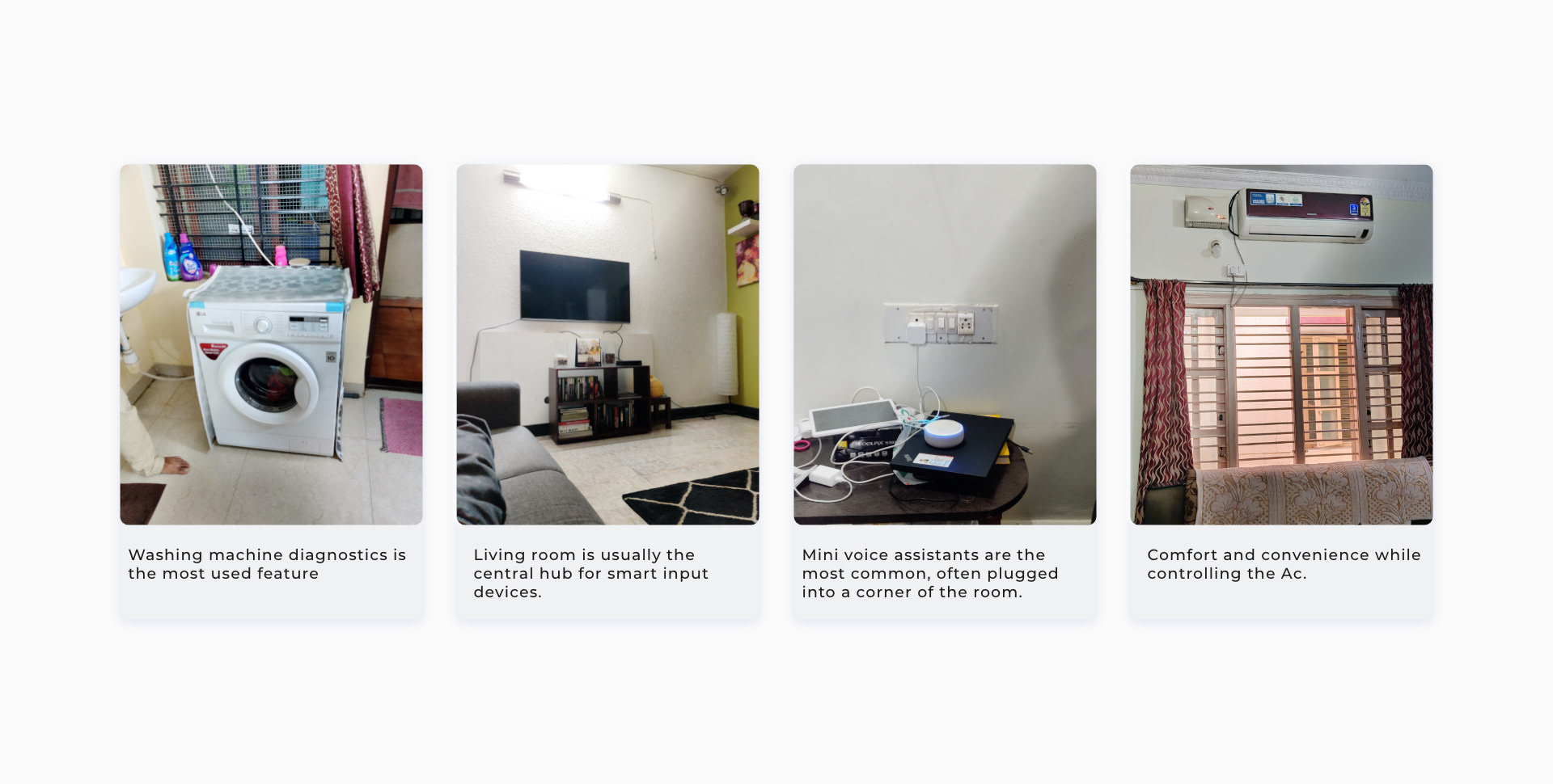
We spent time understanding people’s environments, how they used smart devices day to day, and what they wanted from those devices.
08 / Feedback
Nudges over notifications.
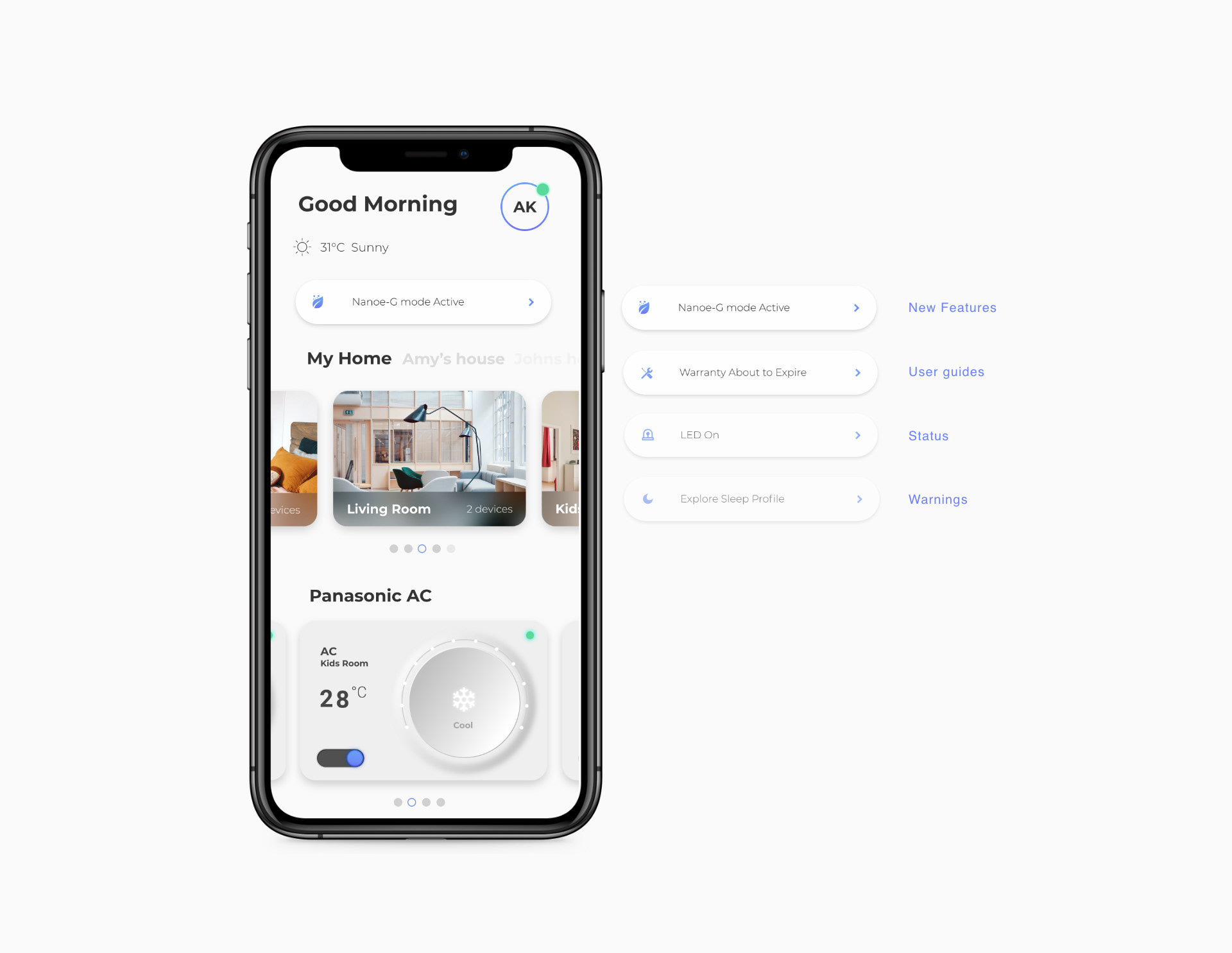
The product gave instant access to vital functions and smart notifications based on device status, enhancing engagement and the overall experience.
09 / Validation
Experiment-led validation.
We tested concepts that recreated physical interactions familiar to Indian consumers in an engaging, intuitive interface. The exploration guided a design that fit the connected-experience philosophy.
10 / Familiar objects
Bringing in familiar objects.
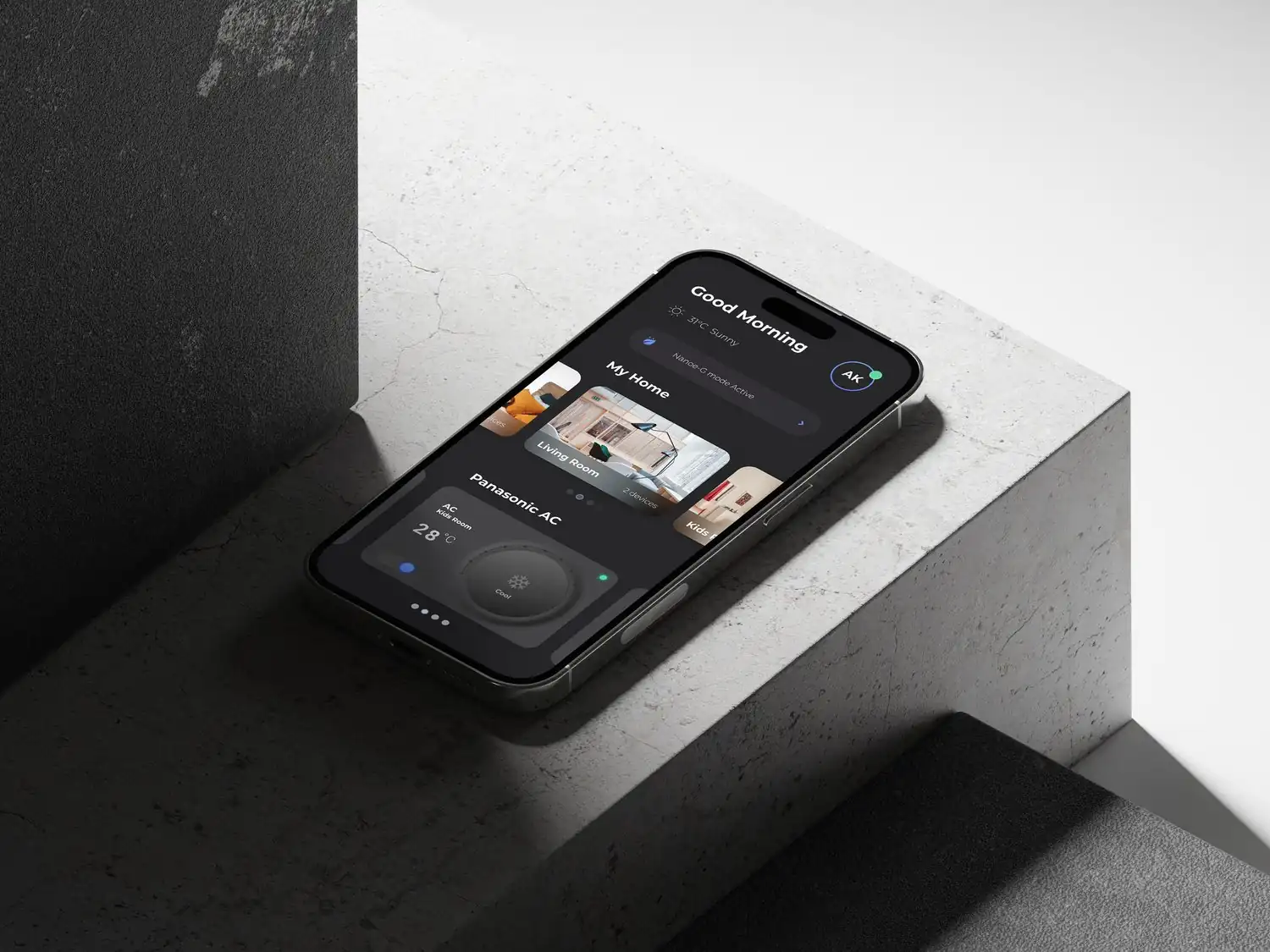
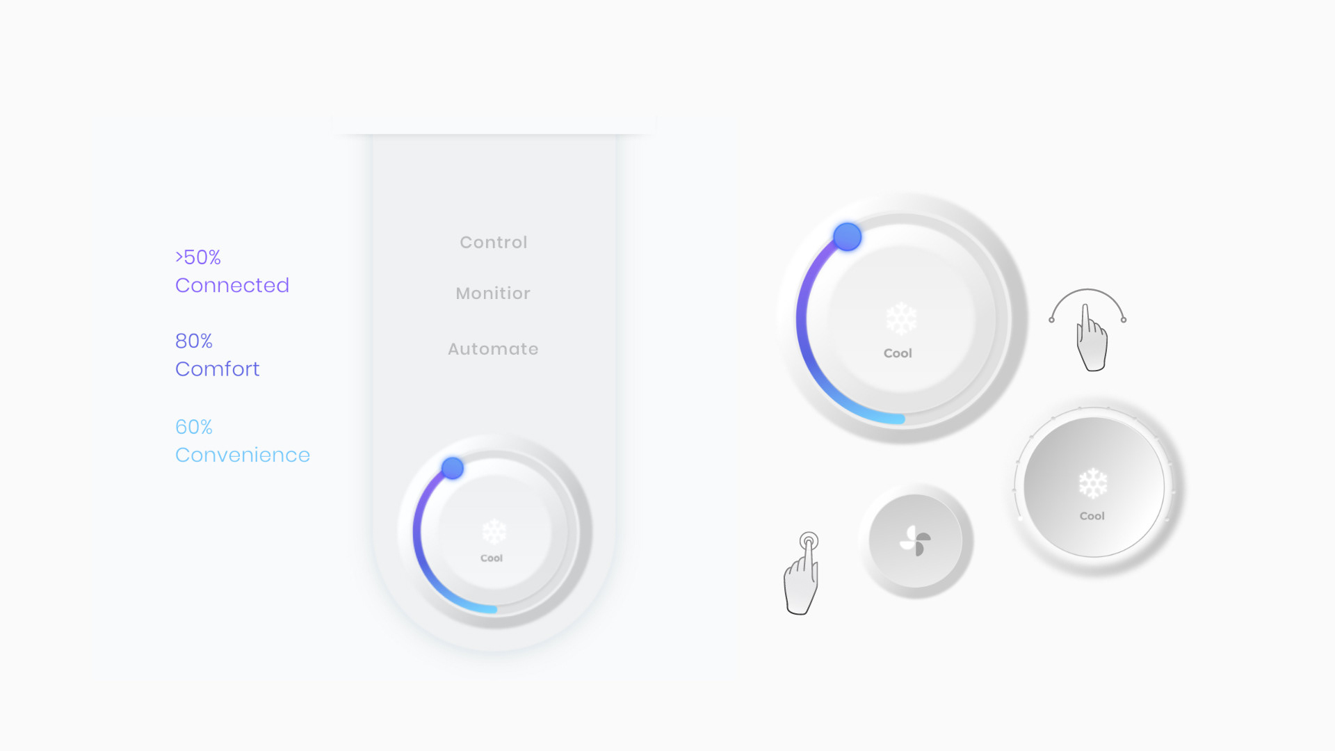
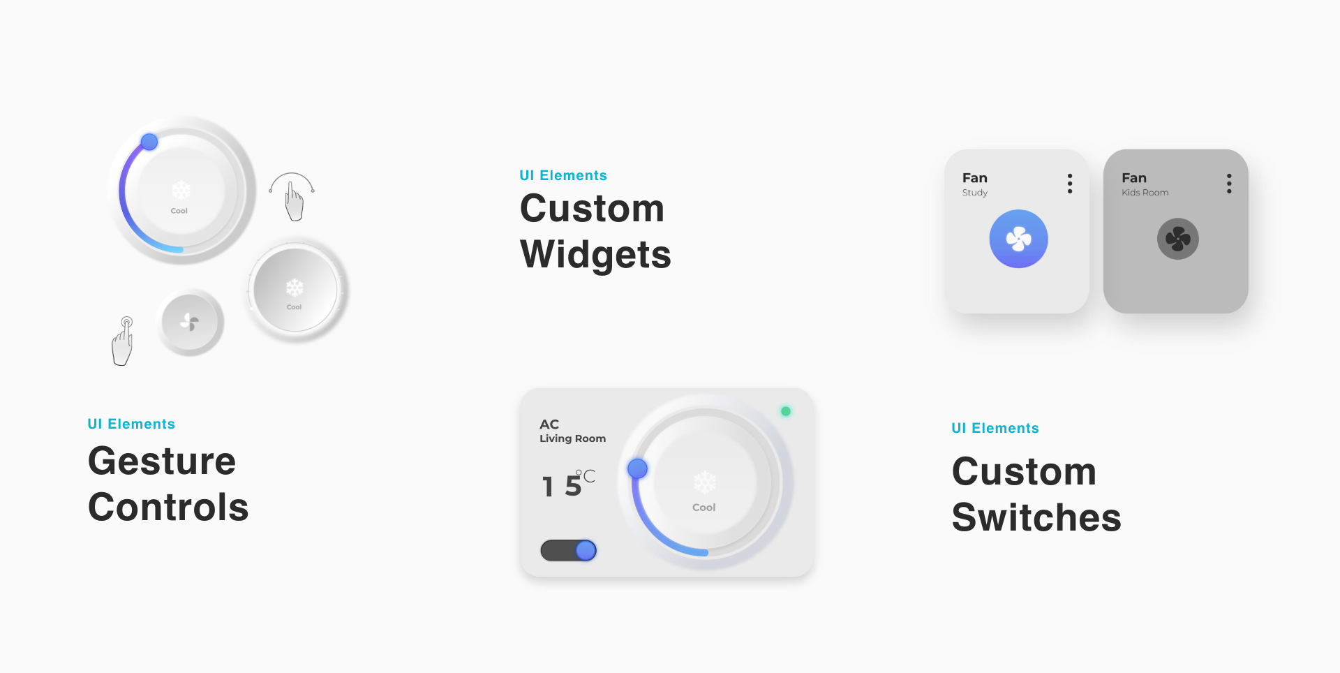
A subtle neo-morphic UI replicated familiar objects such as switchboards and thermostats, making the application easier to navigate, more engaging, and adaptable.
11 / Widgets
Widgets.
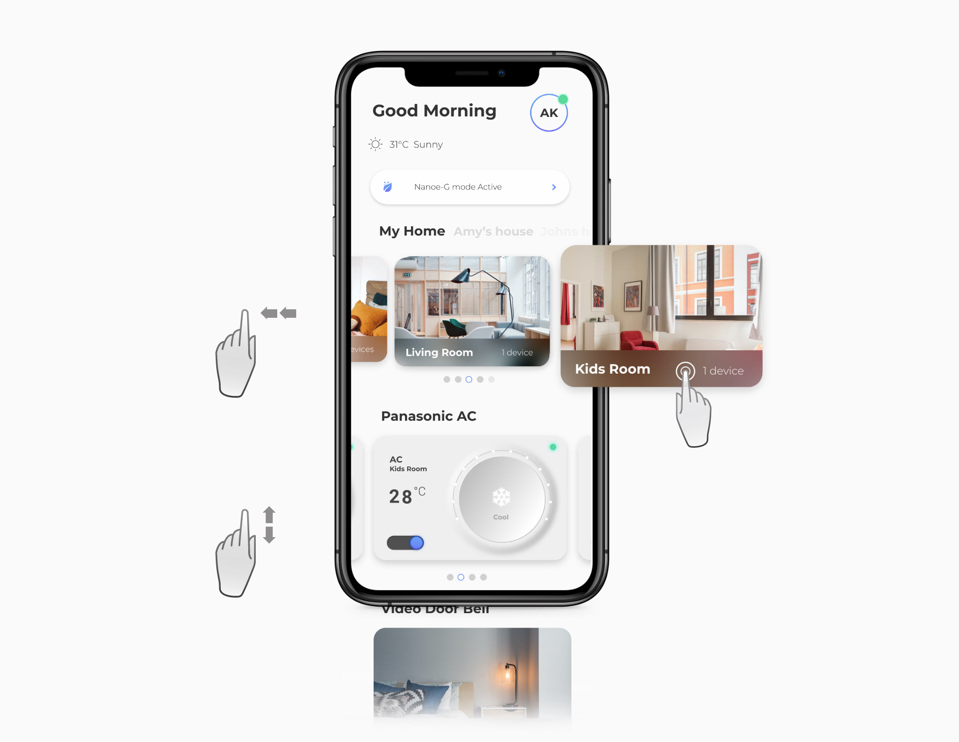
The home dashboard uses layered interactions such as swiping and tapping, with visual feedback and uncluttered secondary options, while keeping the three user groups in focus.
12 / Navigation
Multi-gesture navigation.
Multi-gesture navigation gives access to rooms and smart items through intuitive controls and visual feedback, enhancing engagement and enjoyment.